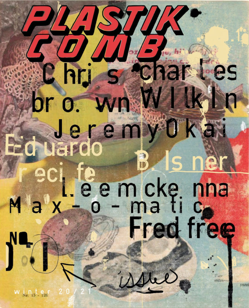
We spoke with Aaron Beebe, Plastikcomb magazine’s editor and mastermind, to know more about his latest printed project. The magazine’s a mix of art and design with an independent attitude and quite a lot of visual agitation that collage freaks will just simply love.
TWS –Can you tell us something you’d like our reader know about yourself?
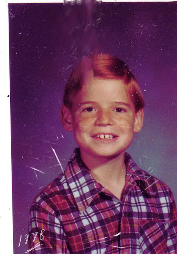
AB –I am a left-handed, red-headed, step-child, and a design school drop out. I mostly grew up in Virginia Beach, Virginia, where I skated and body-boarded a lot. I worked for Uncle Sam for a good part of my life doing governmental stuff, and boring bureaucratic things, while traveling the world. I could never get a real job as an art director, so I started my own magazine to declare the title. I am constantly doing projects, and will commit myself to one, before completely finishing another. My French bulldog eats shoes, and is named Garfield Lasagna. I have a love-hate relationship with Garfield, the cat, but we won’t go there. I really don’t consider myself an artist as much as a maker of stuff.
TWS –How did your latest editorial project, Plastikcomb magazine, started?
AB –The idea coincided with me starting collage in 2013, after being heavy influenced by Charles Wilkin’s Index A. At that time, I had the idea for an art magazine, along with the name, which is a metaphor for collage. The original intent of Plastikcomb was not to have it be collage centric, and expand to showcase artists of various mediums. I have no formal training in anything, and mostly fake my way through life, or act like I know what I am doing. So pretty much I thought it would be cool to make a magazine, and finally seven years later here we are with PCM 1.0!
TWS –Which magazines / publications were the ones that influenced you the most and work as references that guided and inspired you when working on this project?
AB –: I was introduced to Raygun through my best friend Chris Ferebee in the early 90’s. He had actually worked with David Carson on a few editions, and they used some of his artistic imagery. When I first saw the magazine I was instantly hooked, even though I really didn’t know much about graphic design or typography and still don’t. (Mmmm, pretty words and pictures.) Each page was a work of art in themselves, which Plastikcomb really draws from. I have been asked if my inspiration came from Blah Blah Blah or The Face, but honestly, I really don’t know much about those publications.
TWS –Plastikcomb is a collaboration with design and typography agitator Thomas Schostok. How did that collaboration happen?
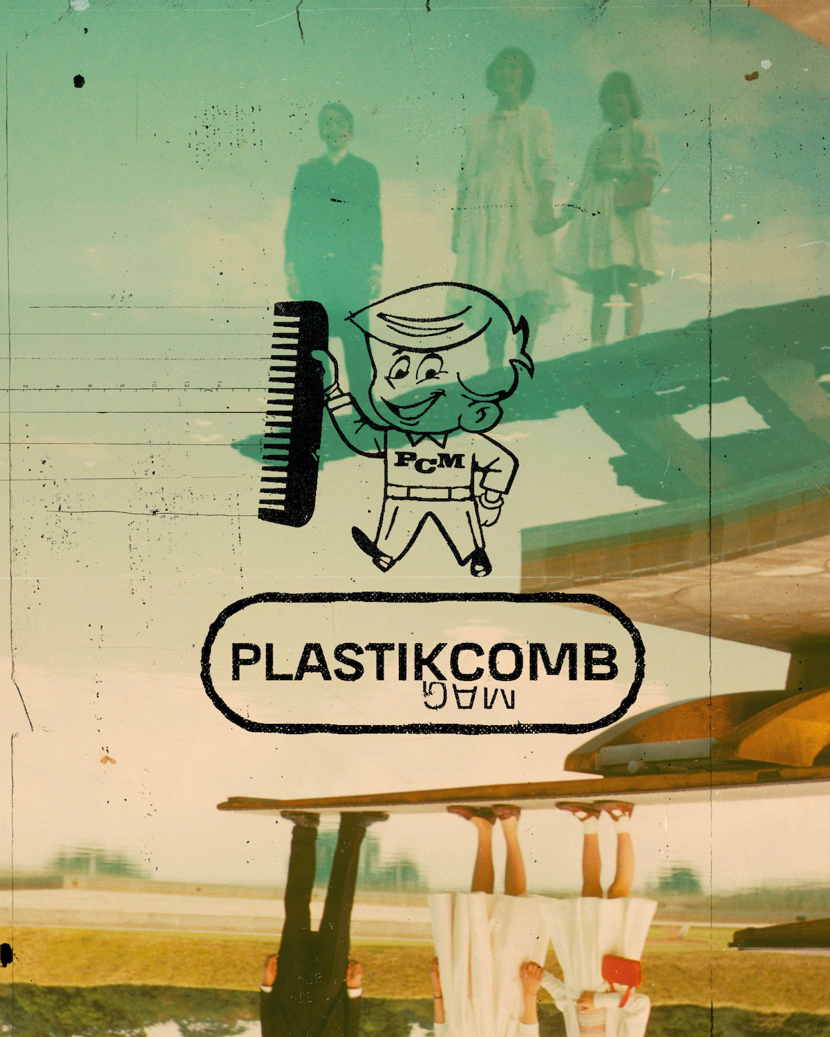
AB –Early in 2020, I designed and published {th ink} 2: objectextion. One day I randomly thought about how I was spelling the name {th ink}, and how it closely resembled the name of an artist that I followed, {ths}. I didn’t know Thomas at the time, but wrote him and asked if he cared about how I was naming my publication, out of respect. He immediately responded to say it was fine, inquired about the project, and asked to submit a piece for the book. Shortly after finishing {th ink} 2, I decided to start on PCM 1.0, and immediately thought how Thomas’ trashy style would be a perfect fit for the overall design aesthetic of the magazine. It was a shot in the dark, but asked any way, and he said yes. I couldn’t believe it, and still can’t. I owe the dude a lot, he has been very accommodating and patient with my lack of knowledge on how to run, let alone make a magazine. I truly hope he sticks around for more issues. If anything, I at least gain a good friend from this crazy adventure. Plus, he brought us Dusty, the first ever magazine mascot!
TWS –What’s your editorial approach at Plastikcomb? What do you want to talk about? And how do you want to do it?
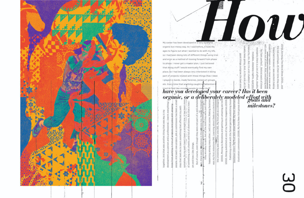
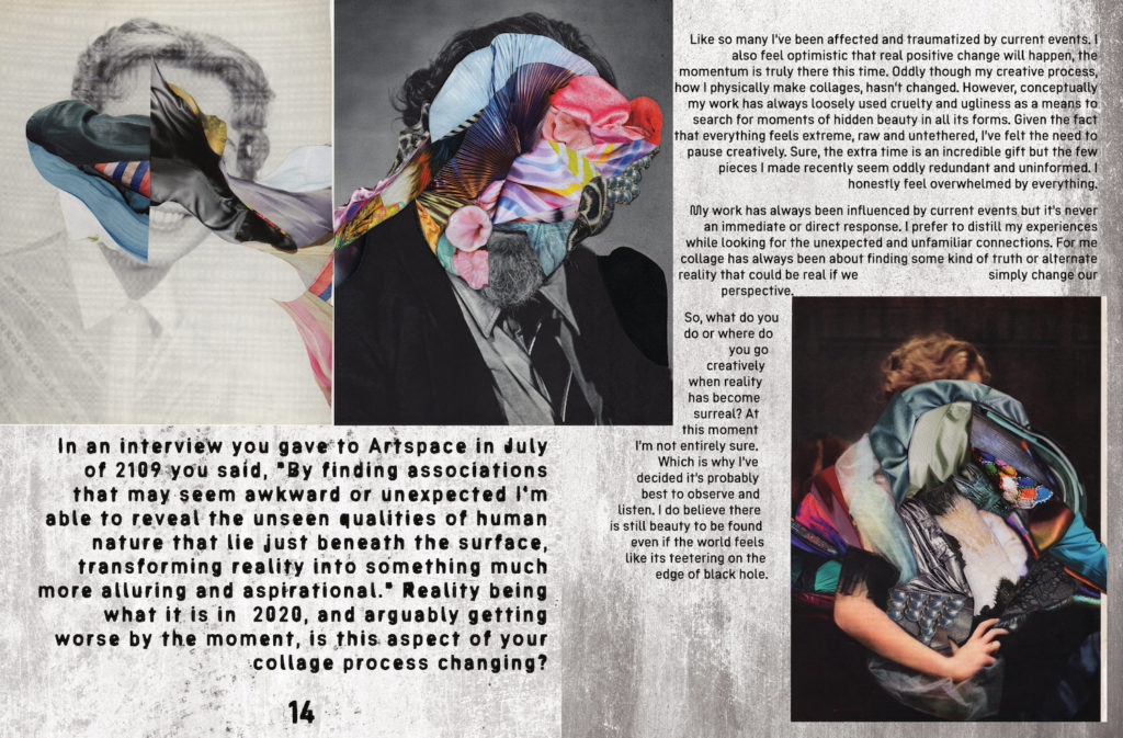
AB –The idea is that the words become one with the artist’s work. It’s not simply type on a page, the placement makes the reader physically interact with the magazine making the whole publication an art piece in itself. Each layout will be unique, based on the artist’s style of work. Along with thoughtful interview questions, based off of in depth research done on each artist. Plus, we will bring in other guest graphic designers to give new perspectives on the artist’s layouts, and it also provides more opportunities for the design community.

TWS –Why printing a magazine in “the digital age”?
AB –Having something tangible in your hands to read, look at, and feel is what we need in a two-dimensional world where everything is emotionless, and erased from our memory with one swipe of the index finger. Is there anything groundbreaking about this magazine? No, not necessarily, but it will provide a platform for artists, designers, and writers to display their work, tell a bit of their story, and perhaps give a non-virtual experience of inspiration. Also, who doesn’t love the smell of freshly printed ink!
TWS –Can you please talk about the design and art direction of the magazine? How are you planning to work on the upcoming issues? Will there be a coherent line? or will you take each new number to different (visual) places depending on the collaborators or content?
AB –The overall aesthetic is intentionally to not have conventional magazine layouts, to go “against the grid,” and have more of a free flowing conversation between the images and typography. Based off this, each edition will be different depending on the collaborators and content. Sure Carson and Ashworth did it for Raygun, but Plastikcomb is an art, not music publication, so it presents more of a challenge when working together tastefully with the artist’s work, which has never been done before.
I already want to make Plastikcomb Two. We will reach out to the artists we wish to feature shortly, but no plans on who as of now. Although, if you can give me Micosch Holland’s contact info, that would be great, I would love to have him in PCM Too.
But I do hope that in 5 years we are talking about PCM 9 or 10, and that it becomes as popular as the more high end art publications, like Juxtapoz or Hi-Fructose.
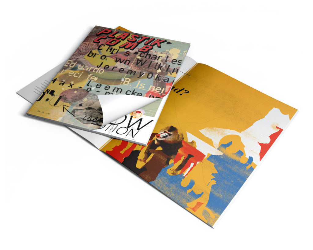
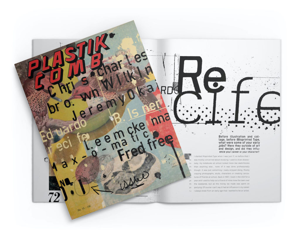
TWS –Would you use Plastikcomb to make collages?
AB –I wouldn’t personally, but it might be interesting to see what some artists might come up with.
TWS –What’s your definition of collage?
AB –Like I had mentioned earlier, Plastikcomb is actually a metaphor for collage. In the States, when it was picture day, you used to get handed a plastic comb, in which your current hairdo was combed to make you look “presentable,” and more than often you ended up looking like a completely different person. Like collage, you take an image, and make it something else, or perhaps give it a new purpose or meaning.
TWS –What people that are reading this right now should know so they go and buy it right now?
AB –PCM 1.0 will be sold on our web-page, www.plastikcombmag.com. Please go to the site, and get your copy today! Dusty and the PCM Team thank you for your support!
“It’s like biting into a bratwurst, but it tastes like cake, mmm..delicious.” – {ths} describing PCM 1.0

