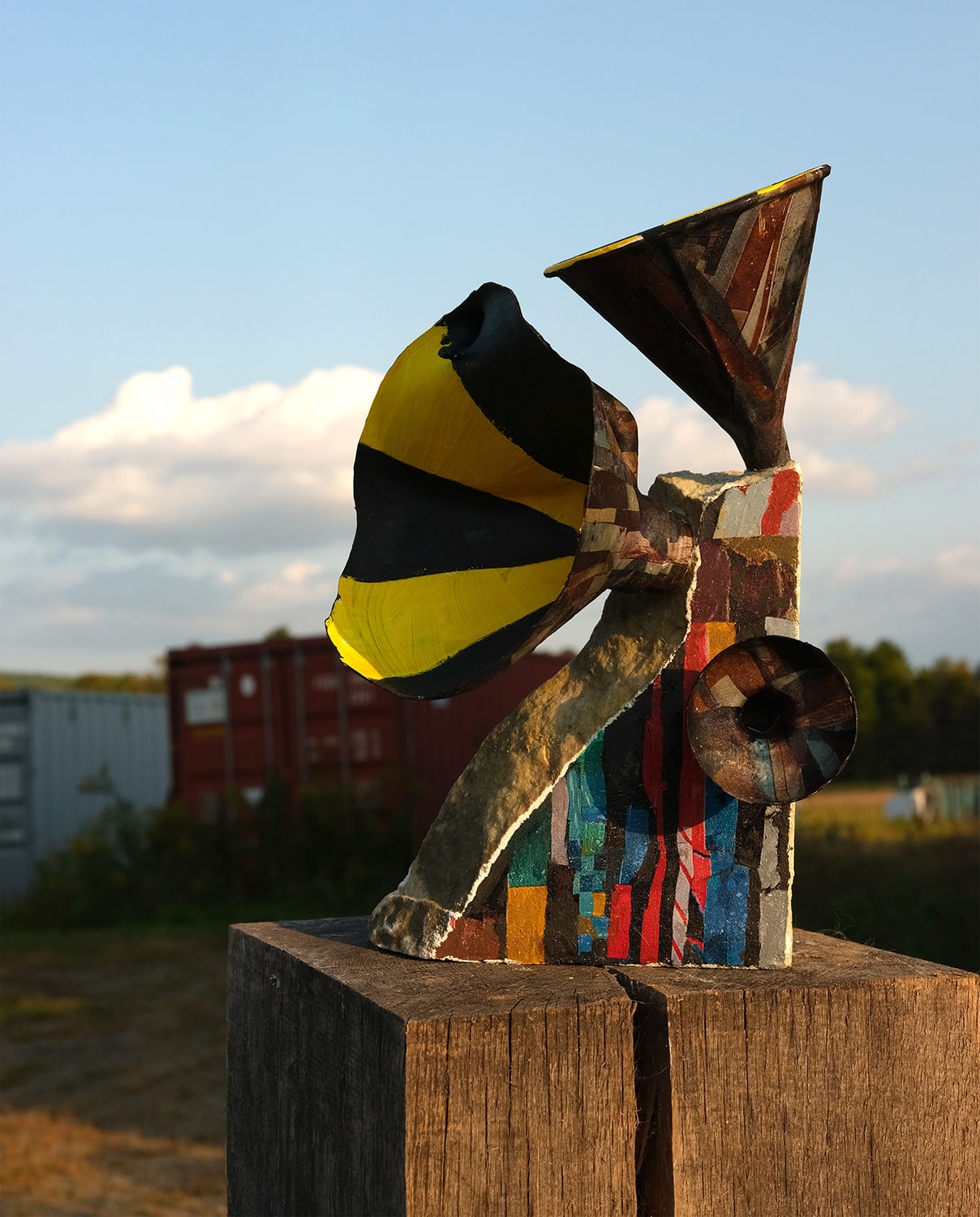
In this second part of the interview, Michael discusses Cut Me Up Magazine and the process of curating Issue 6: Object Lessons, the importance of books, the Mad magazine Fold-In and how the resurgence of collage in the 21st century reveals its roots in the 20th.
Essential Encounters
AB: How do some of the ideas that you explore in your work relate to the ideas of Cut Me Up? What drew you to want to work on Cut Me Up?
MO: At the center of my practice are books. That first started with me as a reader, as a childhood reader. I always say that reading saved my life. I was fairly isolated in the countryside in Vermont. We traveled as a family mostly to places of natural wonder and campsites. We never went to the city. Reading was a way for me to travel (virtually) and get interested in things. As I got older, the encounter with increasingly more challenging—but more interesting, and more beautiful—books was really important. To this day I buy some books not because of their subjects, but because of how they’re made.
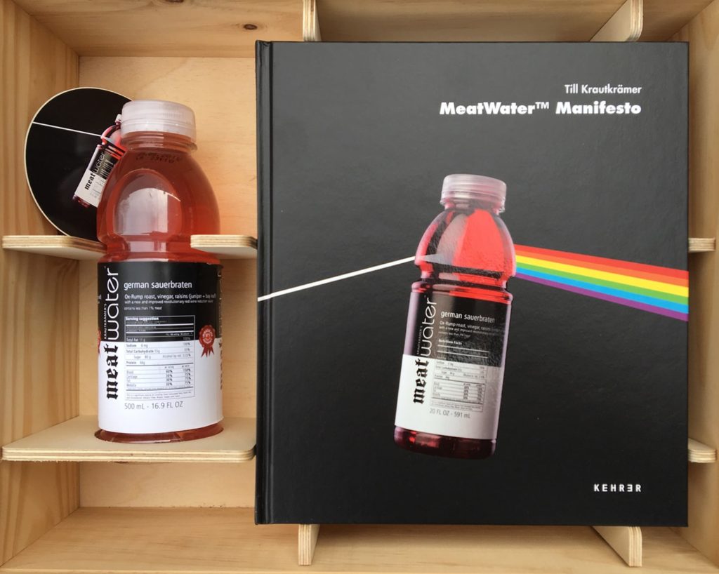
I share lots of ephemera books with my architecture students. I have a great Led Zeppelin book that has stuff that you can pull out. But I also have my friend Till Krautkrämer’s Meat Water box set, which is a book about his fake company that makes meat-flavored water. Till sent me a wood-burned, branded, beautiful wooden box with a bottle of Meat Water in it. And The Meat Water Manifesto book, which is like the Pink Floyd Dark Side of the Moon album cover, with the prism and the spectrum, but what’s casting light is a bottle of Meat Water. Inside is 200 pages of his crazy project.
I think that when you can show students something that has physical operations and a really beautiful design sensibility, that’s very exciting. Especially in an era where some groups seem to be less and less interested in books, because they take up space and because you can get all the info that you want from your phone. So why would you want an essential encounter with an object?
As soon as Todd (Bartel) told me about Cut Me Up, I was like, that is in my pantheon. A book that transforms. And that’s also what I do as a collage artist. Every book says to me “cut me up,” that’s what it’s yelling when I’m interested in it. So there’s that relationship to the process. I mean, Cut Me Up Magazine is the most succinct directive about collage that I’ve ever heard.
I think it resonates with that directive from another great book which is Alice in Wonderland. Alice encounters a bottle that says “Drink Me” and encounters a little tea cake that says “Eat Me.” So, the “Me” in Cut Me Up I think very much personifies the book and gives it a life, and importantly for me, it gives it a second life. 50 percent of the books I have in my collection I read, cherish, refer to and put hundreds of post-it notes in. And then there’s 5000 books that I get to cut up. I buy them in multiple copies because I like to have one un-cut up book. So there’s that first part of Cut Me Up which I would call the directive, the mission, implying the beautifully framed, transformative book.
Then, of course I got to see your work in the first issue. I thought, well, this is a genius idea, you make the book you want to make. But it’s not like a gallery catalog. You’re making it to be cut up so it’s something else. It’s like a coloring book. A code book.
I think that in the first 10 minutes of hearing about the project, I imagined a 50-yearhistory of Cut Me Up and all the permutations it would go through.
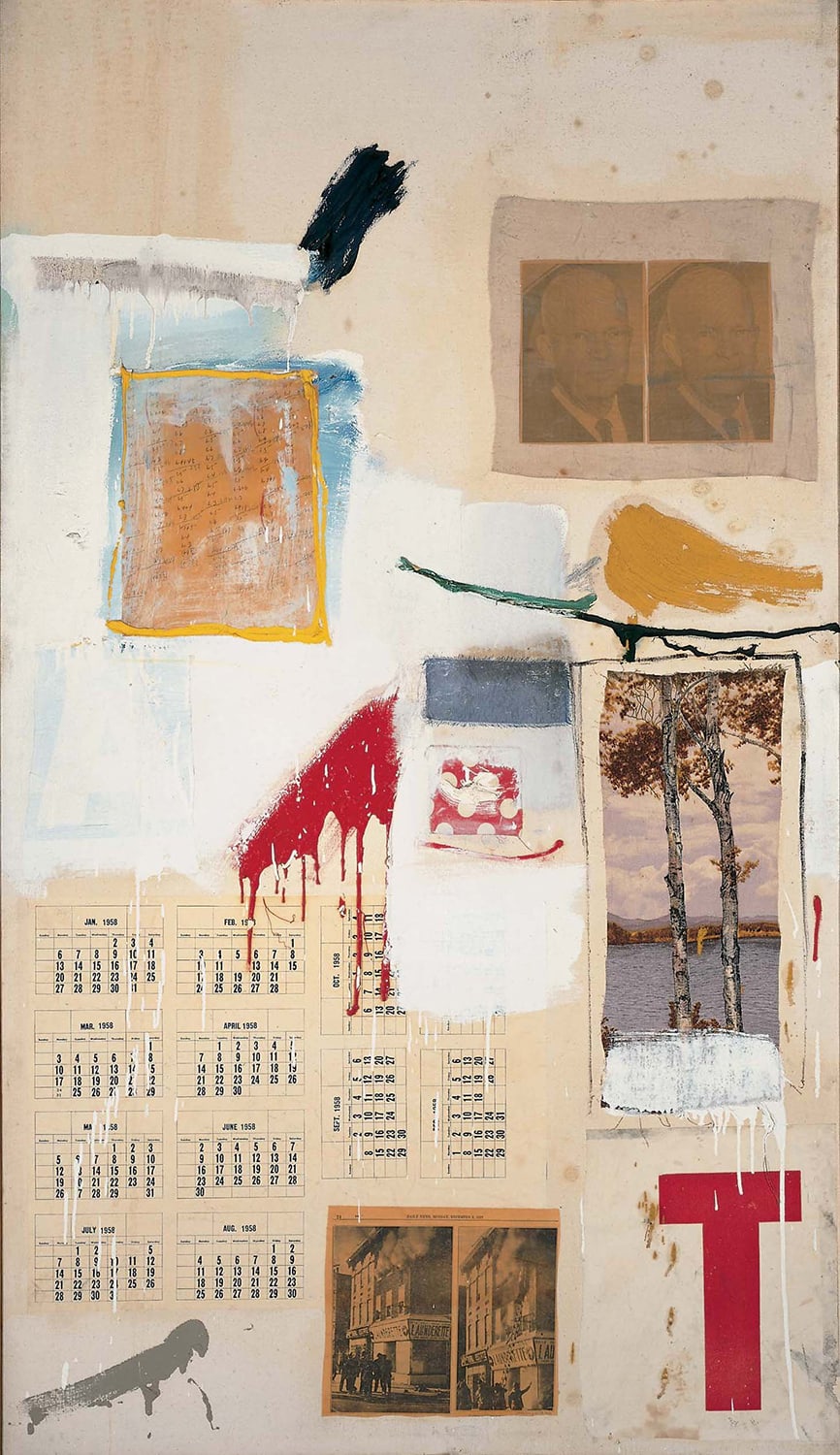
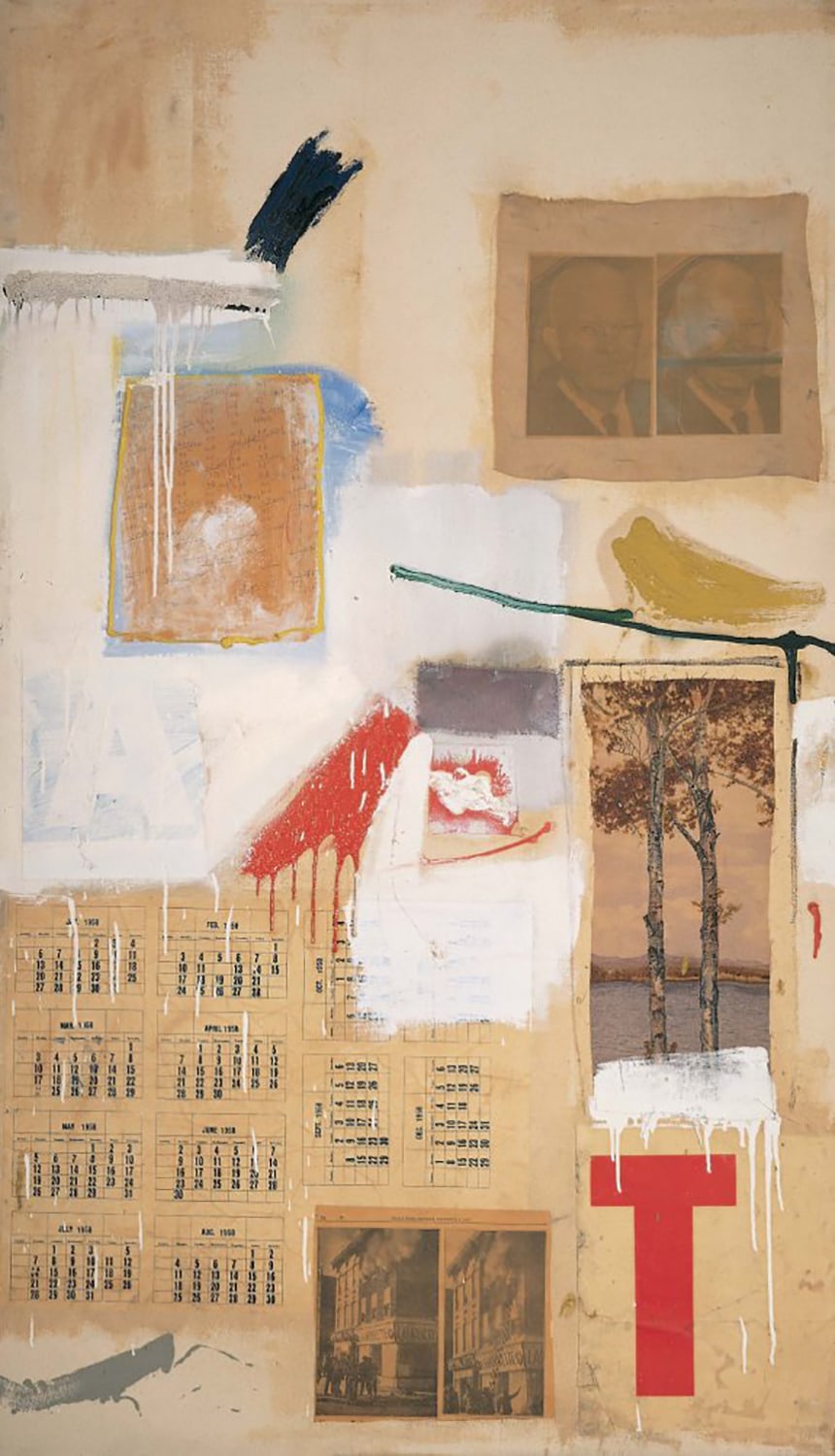
I felt that Cut Me Up was aligned with two artists in particular. I thought that there was something extremely Rauschenbergian about Cut Me Up. Rauschenberg often used the same imagery in multiple ways. In fact, in one of his greatest experiments, he famously made a combine, and then he remade it. He couldn’t get exactly the same materials. His Factum I and II, 1957, was an important discovery for me.
I also remember an incredibleprojectat his retrospective Among Friends, a big show at MOMA about 5 years ago. There was an amazing piece (Hiccups, 1978) that was ninety-seven drawings on cloth that had zippers in between them. The museum could put them in any order that you want. With, to our math, infinite configurations.
With the Cut Me Up archive, there’s always gonna be an unsullied, undisturbed copy of each book. And you’ll get increasingly more remixes of them. That reminded me that there’s the potential for this to have a relationship to another artist, one that many of us love, and that’s Sol LeWitt.

As far as I know, Sol LeWitt is the only artist who continues to make new work after his death. Say someone buys a Sol LeWitt drawing from the foundation—drawing number 123. The person who buys it wants to put it on an 8 by 10 foot wall, but another museum wants to put it on a 50 by 13 foot wall. LeWitt gave his instructions according to proportions, so he wouldn’t say, “make a line at the 3-foot mark,” because you might have only a 2 and a half foot wall. He would say “divide the wall in half vertically, and divide the remaining sides in half, and then divide those,” and so on, so that any piece could work anywhere.
So, as long as people are interested in purchasing those works, and the LeWitt Foundation is going to come to your place and execute them, every work is both a new work and an old work. I think that’s such an incredible idea. Charles Schultz famously did not give permission for anybody to draw new Peanuts cartoons after he died. But Dick Tracy was made for a long time after Chester Gould passed away. Different people have taken over Blondie; there are new strips drawn by different people. So there’s something of the LeWitt DNA in that idea of Cut Me Up.
I guess the other truth about it goes back to Walter Benjamin and The Work of Art in the Age of Mechanical Reproduction. He talks about the aura of the singular artwork and is that destroyed by mechanical reproduction. I would say just the opposite has happened. Magritte famously said that, “my first job is to get somebody to look at the work”. And then Magritte benefited hugely from mechanical reproduction. I mean he became the college room poster guy. Until Farrah Fawcett came along.
By the Book (and Buy the Book)
One could, after you’re gone, take all the back issues of the subsequent curated issues and do it again. Or make “best of” issues with curated choices from the first 18 pages of the magazine. And re-release them into the world for new and wildly different outcomes.
If I was to think about other things that are linked to it, I would think about children’s magazines, where there are “cut along the lines” activities and you can pop something out. But you’re always directed to make these in a specific way.
And then I would also link it to Duchamp’s Boîte en Valise,the museum in a box, because you have artworks, and then on the back of each collage, on the verso, you have essentially the wall card. Each issue is like a little exhibition.
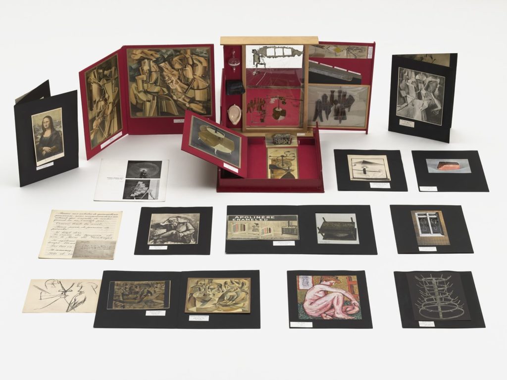
I think the other part of your question about what drew me to Cut Me Up, is that I’ve always had a sine wave of interest in publication. It comes and goes. Sometimes I’m really invested in making books or catalogs and I’ve been realizing that I have a strong affinity with Duchamp and some other artists; in that even their exhibit invitations are like little works in advance of the show.
Over the years, I’ve designed dozens of things for myself and others that are using mechanical reproduction. I’ve used scratch-off (lottery ticket) material coatings and mylar glued onto the center of an invitation. I worked with the Gaylord library company to make custom library card pockets for a show I did called The Last Library. So I see it in a continuum with mostly 19th and 20th century printed objects that transform. I think of Cut Me Up as part of that lineage.


So, I understood the concept very quickly, and once I looked at a few issues, I thought there was maybe a problem that I could address. I don’t mean problem in the sense that there was something wrong with Cut Me Up. I mean, how do you bring something to another stage in its evolution?
The problem that I wanted to work around was, if Cut Me Up keeps going the way that it does for the first 5 issues, you’re going to get a disproportionate amount of works that are, let’s say, Schwitterian. Because people seem to be using it largely as a tearing and texturing machine. I mean it’s not true across the board, but there was a lot of that. But there were a few images that leaked out here and there in the issues and I thought, ah, objects! That’s what some of these folks are doing. Somebody who took it outside and photographed a wall, or somebody who really did make a more object-like thing. And so, I think that the curator/teacher/problem-solver in me reasoned, “let’s analyze this from the point of view of: what could lead to some different visual outcomes?”

MAD About Conceptual Directions
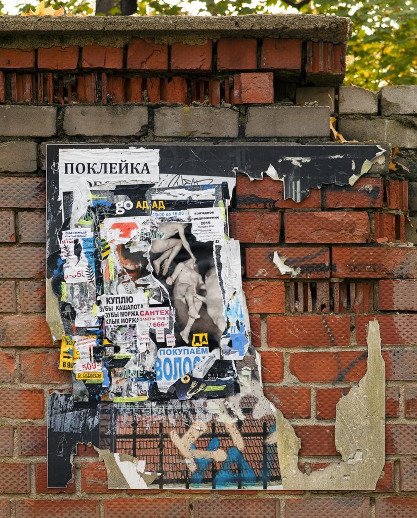
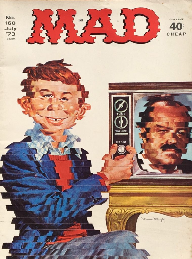
But that wasn’t my first thought, my first thought was sound. The concepts that I plowed through, other than the sound one, didn’t hit me as hard as assemblage, because it really is the second cousin of collage. I think some other ideas were exciting, too: playing with the sequential frame, like a comic book, because I really like narrative art. But I didn’t want to attach narrative to it necessarily, I wanted to see what people would do with a bunch of frames. Sort of a Cartesian grid, however you wanted to distort it or exaggerate it. And then because of my love of Mad magazine, I thought of the fold-out and what context that would work in. The idea of pitching the fold-out for a deliberately 3D call seemed really fun. And then, Jaffee (Al Jaffee, who made the Mad magazine Fold-Ins) had just retired at age 99 or 100.
AB: This goes into my next question. In your Cut Me Up curatorial statement, you talk about the Mad Fold-In. Can you explain your experience with the Fold-In and how it influenced your idea of what a magazine could be? I also wonder if you have a Fold-In to show.
MO: So here’s July of ‘69. Skipping all the way to the back here’s the Mad Fold-In.
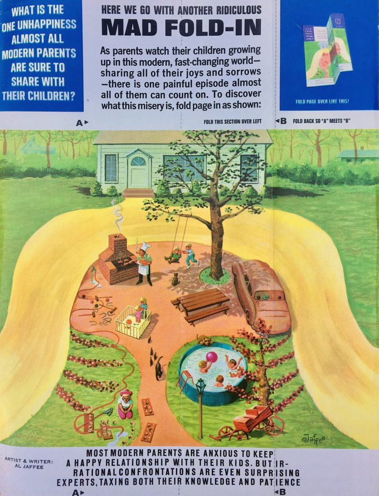
The text is very important. In the middle it says, “HERE WE GO WITH ANOTHER RIDICULOUS MAD FOLD-IN.” Then on the left it says, “WHAT IS THE ONE MODERN UNHAPPINESS ALMOST ALL MODERN PARENTS ARE SURE TO SHARE WITH THEIR CHILDREN?” And on the right, you have the instructions about how to fold it in.
In the middle text, “AS PARENTS WATCH THEIR CHILDREN GROWING UP IN THIS MODERN, FAST-CHANGING WORLD, SHARING ALL THEIR JOYS AND SORROWS, THERE IS ONE PAINFUL EPISODE ALMOST ALL OF THEM CAN COUNT ON. TO DISCOVER WHAT THIS MISERY IS, FOLD THE PAGE IN AS SHOWN.”
So if you were like me, you looked at the picture and then you tried to figure out what it would be. It says, “Most modern parents are anxious to keep a happy relationship with their kids. But irrational confrontations are even surprising experts, taxing both their knowledge and patience.” So then there’s the A and the B and you’re supposed to fold them over.
I’ve never folded this one because I bought it a couple of years ago for my collage material. But somebody has.
So here we go. “What is the one modern unhappiness almost all modern parents are sure to share with their children?”
“A hair-raising experience.” So it’s a hippie.

MO: The crazy thing is that Jaffee would paint them, not having worked it out. He just sort of knew. And obviously, both the text and the image had to line up and say and do a specific thing.
So there you go, The Mad Fold-In. I loved learning that it was his smart-alecky response to the Playboy centerfold. And yet both Mad and Playboy were created for similar reasons: countercultural, daring, pushing the boundaries. I think as a kid, coming across Playboy magazine in your parent’s, or your friend’s parents’, room, underneath their bed, the only thing that you had that was similar was Mad magazine. It was outrageous and really funny and a lot of the jokes were over your head because they were for grown-ups. But you could really relate to a beautiful cartoony drawing. Or a Fold-In. When I was subscribing to it once a month, I got two things: I got Boy’s Life, because I was a Boy Scout, and I got Mad magazine. And Mad magazine was so much more interesting. Except that both of them spoke to these two interests that I had: one was nature and building things, and then jokes. Puns. A kind of transforming image.
Again, speaking of origins, I trace a line to Mad magazine and the Fold-In as an idea about what art should do: it should transform materials, it should transform your thinking.
Just to bring it back, it’s rare that I see a publication that really makes me want to check it out and to be involved with it, and that was Cut Me Up.
Shaping the Issue
AB: How did you want to shape the audience’s thinking about assemblage as an avenue of collage?

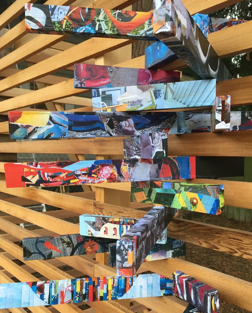
MO: I recognized the inherently educational message of Cut Me Up. I thought the directive was very clear. One thing I love about a great art assignment, or just a great question, is that, there shouldn’t be a predetermined answer.
In my curatorial approach I wanted to see how well people took your source material and made it seem like it wasn’t from the previous book. Even though a lot of it was quite intact, like cutting up the pages and the scripts and weaving them like Kathy Greenwood did. Or wrapping them around the boards like Clive Knights.
I remember us struggling with certain artists that you knew and I knew, because we knew the work was interesting, but there was something else I was trying to get at in the way that each page related. I love, for instance, the transition of Yura Adams’ piece into Todd Bartel’s, which are deeply, formally in dialogue. Todd’s is very canny about art history and Yura’s is a transformation of her studio practice. Both made cool, similarly-sized objects. I’ll call the curatorial process “low-narrative,” but in terms of art history and turning the page, and even the overall color of the pages, from one to the next, it feels like a transformation as well.

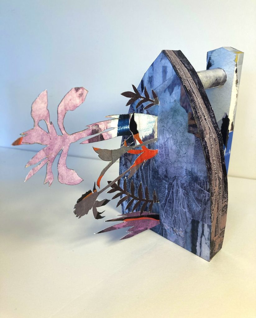
So that’s the other thing that became apparent. Because I’m a teacher, I wanted to have an art historical or process-edge. I wanted the content to be available to the non-art viewer, which is always important. I think one of the ways I’ve built up a good, and large audience for my work comprised of ‘non-art-trained viewers,’ is that I try to, again, foreground audience, not in a pandering way, but as an invitation: “come into this place, if you give it a shot, you’ll get something out of it.”
An Origin Story, Part II
It seems like I have actually hundreds of stories about origins and influences. When I was in the Cub Scouts, or maybe I was in Boy Scouts at this time, there were lots of competitive activities like the Pinewood Derby and the Father and Son Cake Bake, and this one unnamed thing which I think our troop probably originated, as I’ve never heard of it elsewhere. Every scout got a paper bag filled with several Styrofoam balls, a Styrofoam cone, feathers, colored pipe cleaners, cardboard, paper tubes, maybe some glitter, and you had to turn that stuff into something. You had to use everything in the bag, and you couldn’t add anything other than paint or glue.
I remember I made a hobo, with a stick and a bag. But my neighbor, Scott Bell, who was a year older, he made a tv news anchor desk with a camera trained on a newscaster. And it was amazing.
So I made a figure, a doll essentially, a kind of ok-looking hobo with a cigar, a bag and a jacket. But Scott Bell made a whole TV studio. And that was astonishing. I was really jealous. I thought that’s so smart, how do you come up with that idea? Cause I had run away from home once or twice in a sort of jokey way, and hobos were certainly part of kid culture, similar to dynamite, quicksand, cartoons, fishing and other kid activities that were common currency. So making a hobo wasn’t a conceptual stretch. But making the desk, and the weatherman, and the weather chart behind him, and the camera, and the camera operator, was just amazing.
It was probably the earliest thing that I ever made that I would call assemblage, other than the things I built with my dad, which were more carpentry, without the goals of assemblage. Certainly the hobo was assemblage-like. But the TV station really transformed those materials. Experiences like these have driven me. So to think about some people, especially non-art people getting a hold of Cut Me Up and going, “wow, I could try this!”
Life Imitates Instagram
AB: Was there anything that surprised you about the responses or the process of working on this issue of Cut Me Up?
I guess I was surprised by how much I wanted to order the pages, in the end. When I curate shows, and when I jury shows in particular, my first pass is usually pretty right on. I found myself waffling more than usual this time between certain things, because there were several “low-narratives” that I could have gone with. One was purely formal. One utilized a global transformation of color. One theme was all about how these collages penetrate the edge; how does it go off the page? How does it suggest continuum, or not? Some of the still-life objects really are beautifully composed and follow a lot of classical rules. In other instances, I wanted a counter to that.
I’ve seen enough of the things that didn’t get published in print in previous issue, but that you did publish on Instagram. And I would find myself going well, that’s a great image how come that didn’t make it in? And then of course, there were the same occurrences in Issue 6. But I also think that the format that you set up forces you to not make soft decisions. It’s much more of a statement that the curator gets to have by that limitation. I mean, that’s true in anything critical.
What I had my early mid-career survey show at the Tang Museum, Ian Berry, the curator, wouldn’t let me put in everything I wanted to put in. He was like, “you’ve got to trust me on this.” So there was some space in the show and that was essential. I got to have density in certain places, certainly within each collage and within certain environments. But it was a real reminder of all that spatial stuff that you get hit with in in school, and that I preach myself in certain realms, like the design studio classroom. As you know, my personal work is inherently not minimal. I long called myself a maximalist. I’m glad that there are people that want to make the Judd work and the primary forms work, but mine isn’t about that. I think that sensibility extends into how I curate exhibitions, and how I curated this.
There’s an implicit potential for excess in Cut Me Up Magazine. I’ve yet to see somebody do something really minimal. But it came close with a few things like Carla Dortic’s pie. Amy Mahnick’s still-life, where 50% of the page was background. And I have to say that, again, a lot of my choices were made thinking about future issues. I was thinking, “what would create good source material for the next one?”
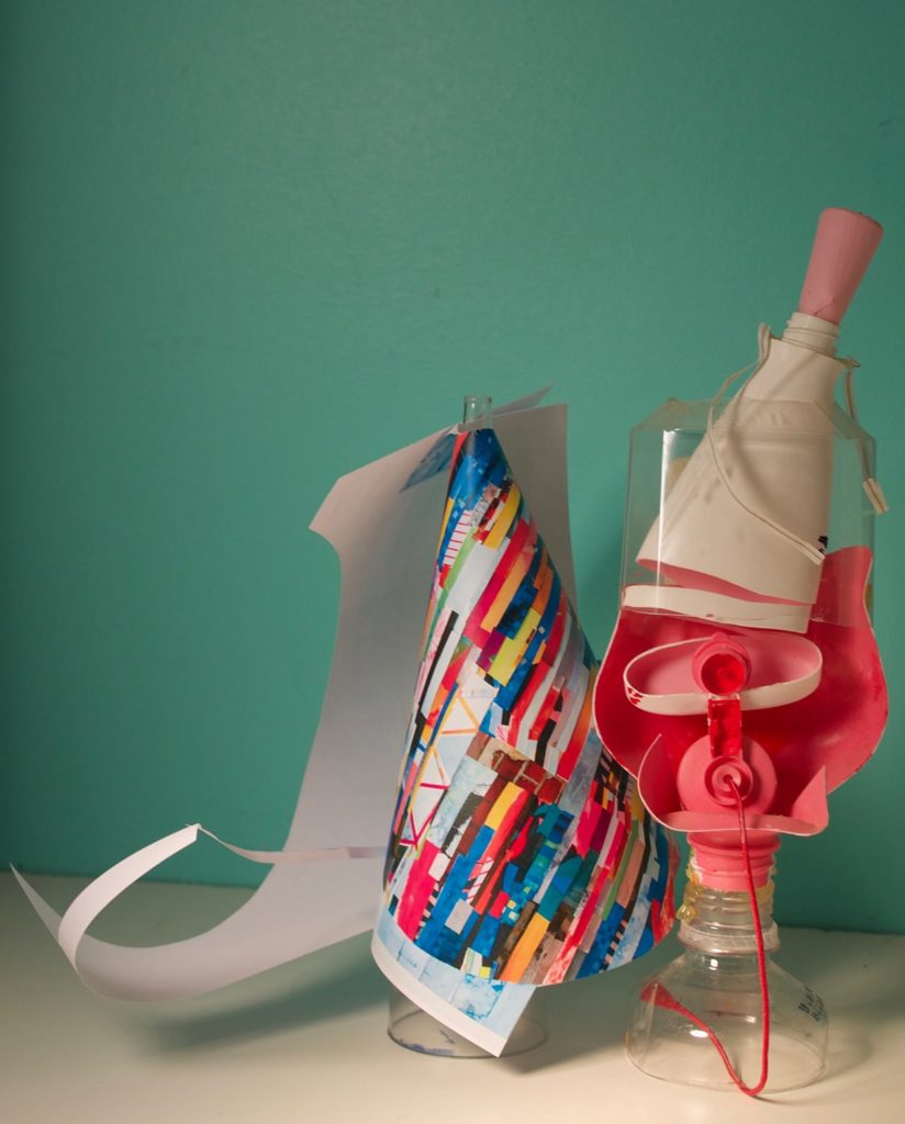
I think that Kike Congrains (who’s curating the next issue) will have a lot to work with. Artists will be contemplating the influence of alchemy. I see the networks, the materials, the myths, the densities and the things—like alembics. I mean, if one wanted to take the material route with alchemy, the transmutation route, and then not the spiritual route, one could easily do that. So, I’m pleased that I think he’s been set up well, by what we called for and what we picked.
The seven or so routes that I was juggling and thinking about were as much for me as a viewer, wanting to see what people would come up with, as they were for me as a curator exercising influence over content. I got to be a little bit selfish, thinking about my recent ideas about the third dimension, not in terms of installation, say, but in an object and image way. I knew that the issue would be mostly flat, but that people would get it there and transgress by cutting up the book, and by bending it.
The Case for Collage Before The Pandemic of 1918 and During (and After) COVID
AB: I think your call opened up the idea of what’s considered collage, as in Karen Stack’s piece where she made and photographed a diorama of a house. Clive Knights pointed out on Instagram that he uses similar kinds of dioramas to teach architecture. I love that each time these different approaches arise, it re-contextualizes what collage is, how the breadth of it is very expansive, and that many things can are a part of it, it’s just a matter of thinking about it in that way.
MO: I would say that we are now in a trans-media art world. There are still people who absolutely need to be called a painter. But we’ve seen a crazy rise in people who would call themselves collage artists, specifically call themselves collage artists. Not like, “well, I make collage and I do drawings.” It’s a medium that’s roaring again in the early part of the 21st century, just like it roared in the early part of the 20th century.
And Kolaj magazine and your magazine and the big art mags giving it more credence than they ever did in the past. You see people like, Alexis Smith, Jane Hammond, Ed Kienholz and Eduardo Paolozzi and many others who had a big presence for a while exerting an influence on younger artists.
You also see a lot of collage artists coming out of nowhere, coming out of the Internet. And coming out of being more psyched about the work of their peers than the work of history.
AB: I think that’s always been the case for collage. The pre-Modern roots of collage came out of activities done at home. People were making things with found materials all over the world, especially Africa, that were roots of assemblage. I think it’s an artistic impulse that’s always been there, just like drawing, it seems, has always been there.
MO: I think you’re right.
I would have been very hard pressed before 10 years ago to identify anything that wasn’t made by the historic mainstream of collage artists. Because it was so much more underground. People were almost kind of embarrassed by it: “I make these little collages.” I heard that a lot. “I make these little collages.” I said it a lot.
So it’s been gratifying to see so many people making collage now and taking it in new directions. And at the same time, echoing a lot of historic moves. The people that I’ve realized echo ambitions of the medium, that continue to resonate very loudly are Hannah Hoch and John Heartfield. I didn’t pay too much attention to them when I was younger. I knew about them through Dada, and certainly you know, Max Ernst’s engraving images cast a very long shadow.
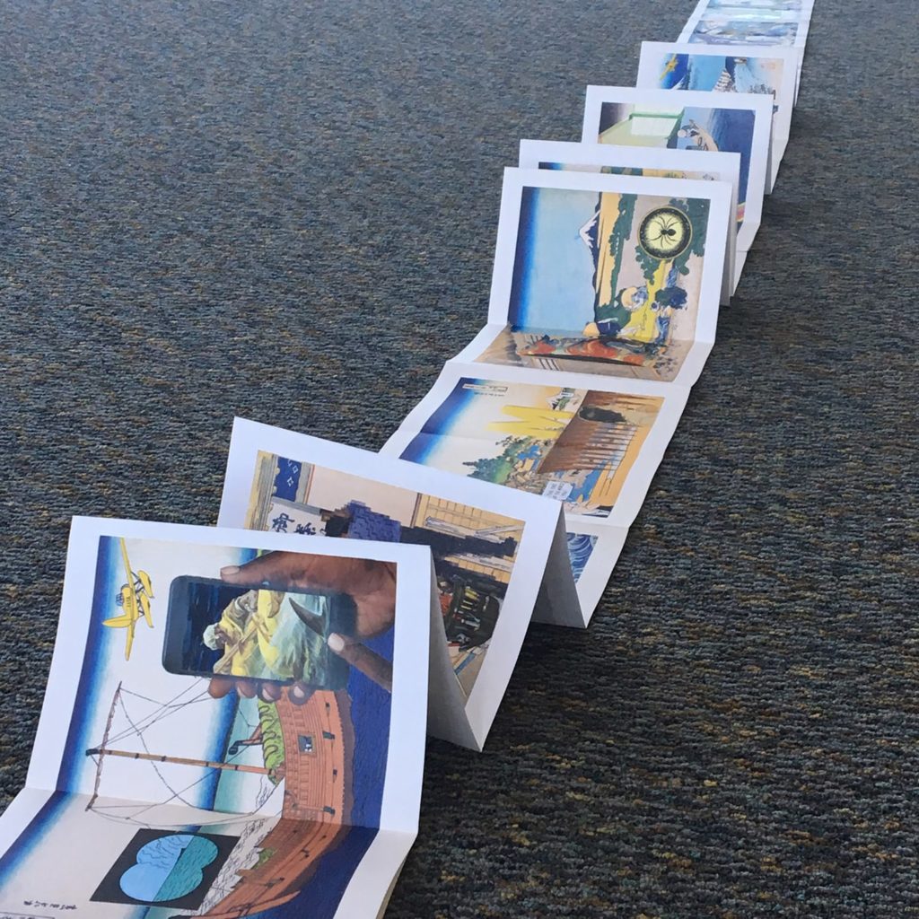
I think that through these younger Instagram artists, I’m taking a look at older artists and heroes of mine and looking at how some of them have taken a very collage attitude toward printmaking. At the beginning of the Pandemic, I spent three months building collages on top of a 48-foot long, accordion-fold Hokusai book. It was like going back to undergraduate school, giving myself over to dialogue. Talking to the dead. I would love to get this reprinted as an art book. I’m reaching out to the company, Prestel, that published the original; I don’t know if anything will come of it. But I shared it on Instagram and a lot of young artists were very excited by it.

I’ve been excited about finding these new artists. And then, whether this is true or not, tracing them back. My brain is always kind of art historically reaching and connecting. And whether they’re responding to a Jasper Johns or Louise Bourgeois, or something else consciously doesn’t matter to me; what’s interesting is that I’m able to use their work as an impetus for rethinking something in my variously broad experience of art history. After all, I’m first and foremost a viewer.
AB: I think it’s interesting, too, that artists may not have those reference points in mind, but that similar imagery and ways of working come up. Even if you’re not aware of those artists, there’s something going on in the human mind that leads the same ideas to emerge.
MO: I remember making a bunch of engraving collages, not knowing about Max Ernst, or his A Little Girl Dreams of Taking the Veil and A Week of Kindness collage novels. And somebody pointed out that I was basically just remaking Max Ernst’s work.
Initially it was a disappointment, because I thought I had invented the wheel. But then, it was kind of great. We both found the same stuff and responded to it 75 years apart. And I started making these images as a 20 or 19-year old and Ernst was making them as a 30-year old inWeimar, Germany. It wasn’t a disappointment, after a moment. It was like, we’re having a conversation. Except one of us is dead.

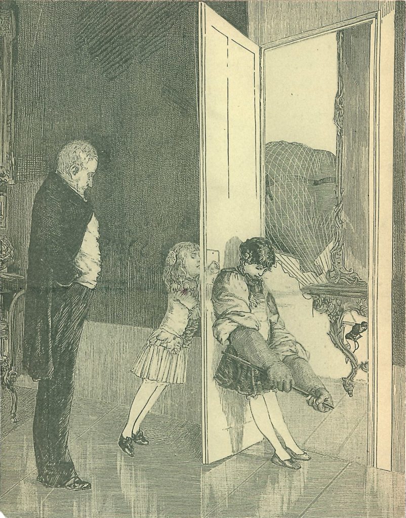
Preceding the Internet and preceding the laptop, my collage archive and every other artist’s collage archive and multiplicity of pictures was how we created our own media environments. Keeping it all balanced and not mixed up was a real challenge. Your job was to reorganize it. Literally, that’s your job. To reorganize it and do something with it. Simple. But sometimes I’m amazed by that with my own ability, or the ability of my friends who make collages, and who work with lots of pictures and lots of sources, to just keep it all straight.
And to bring any coherence between any two pieces or a roomful of stuff because it seems to be like the ultimate distraction machine.
AB:Just to organize things forever. Just keep moving them around.
MO: Exactly.
Books Save Lives, Fucker
I have to tell you that my (recent) heart attack has really clarified a long held position of mine, which is that I’ve been buying books for 35 years, thinking about my retirement or when I can’t do anything but read. That time may come quicker than I thought.
I’ve been really digging into my library and my art collection as pursuits that have been very organic and living. Somebody once described my art practice as like a coral reef, which was one of the nicest things anybody’s ever written about my work, as a coral reef of images, a vast continuum of related pictures.
But I’ve also begun thinking about my books, my art collection and the publications that I’ve been lucky enough to be involved with as another kind of coral reef. It seems to always be yielding new things. And there are parts of it that have died and that I’ve cut away. There are other parts that seem to grow. And there are specific relationships through certain books that I have with people, books that I’ve read, books that I’ve given away in huge quantities to friends who I thought would appreciate them.
The other great, consistent part of my collage and art career has been books. And you know, that goes hand in hand with collage.
It’s not everybody you can share these thoughts with because in some ways, for some folks, books are uncool and unnecessary and old school. And still others think it’s crazy to cut them up!
AB: It’s a very dividing thing. If people aren’t interested in books, it’s like, alright, well, maybe we’re not gonna have that deep of a conversation.
MO: Well, I’ve got this great refrigerator magnet…
AB: Is it the quote about, if people don’t have books, don’t fuck em? Yeah, John Waters.
MO: John Waters saw my eugenics show at MASS MoCA and really loved it. It was cool to get input from somebody like him. He’s the perfect reader of Cut Me Up. How about having Waters curate an issue?
Find more about Cut Me Up magazine on their website or Instagram account and about Michael Oatman on his Instagram or everywhere!

